Seventy-six UI tests passed. Two range controls were still outside the window.
Swing Trainer's Live Studio passed its presentation suite, but a real 1149×772 window clipped critical capture controls. Why visual verification remains a separate release gate.
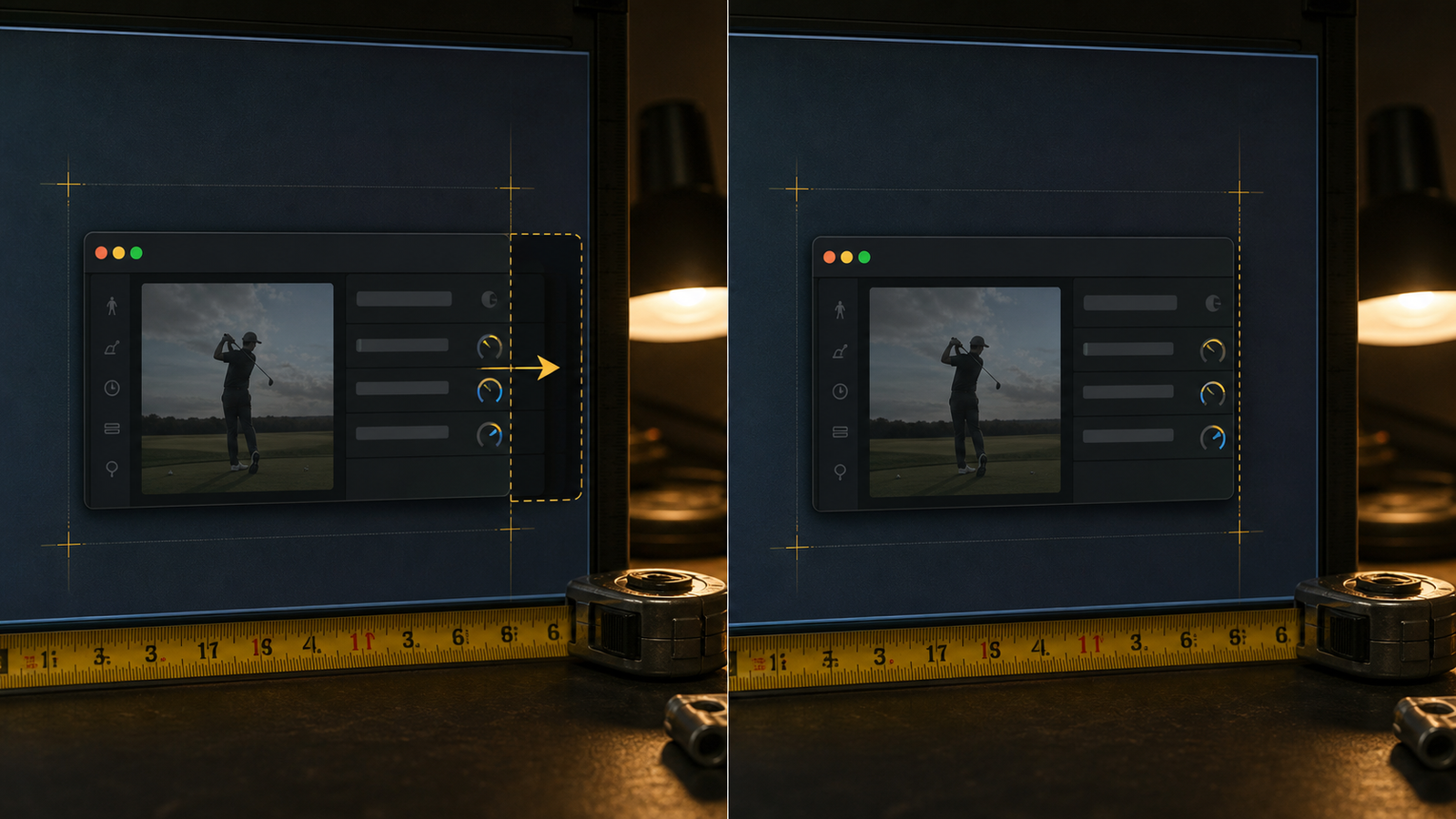
The Live Studio controls existed. The view hierarchy contained them. The tests knew their labels. The build was signed and installed.
At roughly 1149 by 772 pixels, the iPhone Down-the-line selector and the right edge of Live Evidence sat outside the visible window.
The feature was in the software and absent from the product at the same time.
The layout assumed width it did not own
The capture rail placed two Same Take selector groups side by side. Each group had a reasonable minimum width. Together, plus spacing and the Live Evidence affordances, they required more horizontal room than the actual workstation provided.
Nothing in the logic was broken. The mistake was architectural: the layout treated its preferred arrangement as a guaranteed environment.
On a larger development window, it looked fine. At the physical verification size, the rail continued past the right edge.
A presence test is not a visibility test
UI automation is good at proving that controls exist, carry the right text, and respond when the harness can address them. It is weaker at proving that the person sitting in front of a particular window can see the entire control under real geometry.
The fix made the selector pair responsive. When the 330-point capture rail cannot fit both groups side by side, they stack. The interface preserves both camera-view choices and leaves the Live Evidence area reachable instead of compressing labels into ambiguity or letting the trailing edge disappear.
The complete Mac presentation suite passed 76 of 76 tests after the change. The application signature and pinned FFmpeg boundary remained valid.
Then the step that mattered happened: the new build was installed, the window was returned to the same approximate size, and both selectors plus the Live Evidence affordances were visibly inside the frame.
That is physical evidence for one responsive layout defect. It is not evidence for automatic swing capture, Address or Finish accuracy, camera thermal behavior, or a real-golfer range session.
What I want future UI checks to ask
The old question was: is the control present?
The better questions are:
- Is it visible at the smallest supported workstation size?
- Is its full label readable?
- Can it be reached without an undisclosed horizontal scroll?
- Does the neighboring content remain visible after it adapts?
- Was the exact failing geometry exercised after the fix?
Those questions turn responsive behavior from a design preference into an acceptance test.
Seventy-six green tests were useful. The clipped physical window was useful too. The product improved when we allowed both pieces of evidence to be true at once.
The controls had always been there. The fix made them available to the person using them.